Vercel · pricing · SaaS
Vercel’s pricing page, inspected
A UX teardown of Vercel's pricing page: why a flat '$20/mo' understates a usage-based bill, and five ways to set the right expectation up front.
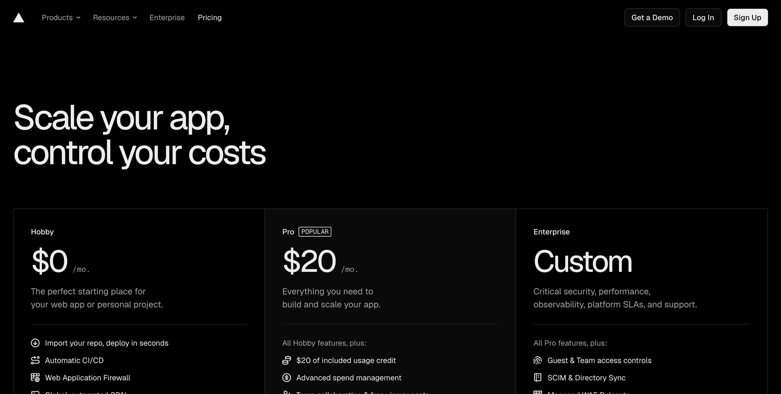
- Tall hero pushes the plans toward the fold
- “$20/mo” reads as flat, but the real bill scales with usage
- Enterprise "Custom" gives no anchor to gauge fit
3 critical blockers
-
The headline price hides a usage-based bill
Pro leads with "$20/mo", but that's a base — real cost scales with usage on top. A visitor anchors on $20 and can be surprised by the first invoice. The page's own headline, "control your costs", names the exact fear the card then triggers.
-
The plans start below a tall hero
The first screen is mostly the headline on black. On load, the Pro plan a visitor came to weigh is only just entering view, so the page reads as emptier than it is.
-
Enterprise is "Custom" with no anchor
A buyer can't tell whether Enterprise is remotely in range without booking a call, so some who would qualify quietly self-select out.
Where the 7.0 comes from
The craft is excellent and the “Popular” badge on Pro gives a clear default — that part is done right. The gap is expectation-setting: a usage-based product presented with a flat monthly number. The headline promises cost control, so the page clearly knows the fear; it just doesn’t resolve it where the buyer is actually deciding — on the plan card.
5 quick wins
-
Say the model on the card
“$20/mo base + usage” sets the right expectation before the click, not after the invoice.
-
Show a typical bill
A "most teams pay around $X" example or a small estimator delivers on "control your costs" at the moment it matters.
-
Surface spend controls
If spend caps or alerts exist, put them on the Pro card — that reassurance is exactly what this audience is scanning for.
-
Tighten the hero
Bring the tiers up so the Pro plan is fully visible the moment the page loads.
-
Anchor Enterprise
“Starts at” or “from” lets larger buyers self-qualify instead of guessing whether to reach out.
How the score is read
Every page is read through the same four lenses and scored on one scale, so the number means the same thing on your page as it does on anyone else's. Most real product pages land between 5 and 7.
- Losing people A first-time visitor cannot tell what this is, or the path to the core action is broken. Fixing one thing here moves more than a redesign anywhere else.
- Works, leaks Nothing is broken and motivated people get through. The losses are the ones you never see: hesitation, comparison, quiet exits.
- Deliberate Someone has thought about the sequence, the copy and the moment of doubt. What is left is refinement, not repair.
The four lenses behind this number, and why it is a judgement rather than a calculation, are set out in the Uxerfy Score.
A headline price is the number the whole relationship is measured against. If the real bill is usage-based, the card has to say so on the page — otherwise the first invoice becomes the moment trust breaks.