Linear · pricing · SaaS
Linear’s pricing page, inspected
A UX teardown of Linear's pricing page: why four equal plans leave the visitor to choose alone, and why the yearly toggle never shows the saving.
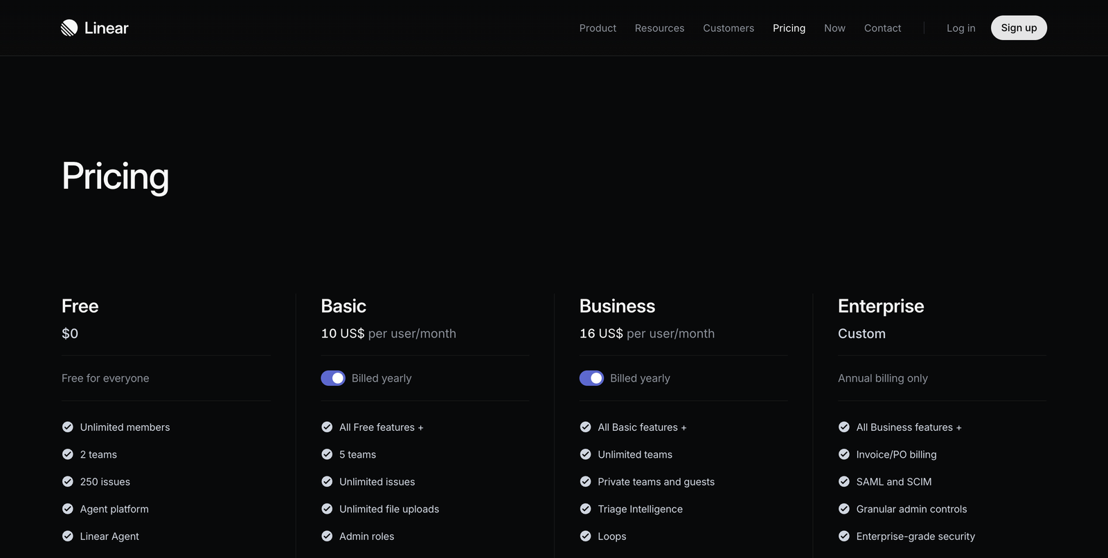
- Tall empty hero — the plans start low
- No plan is marked as recommended
- “Billed yearly” is on by default, but the saving isn't shown
3 critical blockers
-
No plan is marked as recommended
Four columns carry equal visual weight. With no "most popular" or default, the visitor has to compare all four and decide alone. Pricing pages that convert well make that choice for the average buyer instead of leaving it open.
-
The yearly toggle hides the monthly price and the saving
Each paid plan defaults to "Billed yearly", but the page never shows the monthly figure or how much yearly actually saves. The visitor commits to annual billing without seeing what they're trading for it.
-
The plans sit below a tall, near-empty hero
On load, most of the first screen is the word "Pricing" on black. The tiers a visitor came to compare begin near the bottom of the fold, so the page feels emptier and slower than it is.
Where the 7.5 comes from
Linear’s page is calm, fast, and beautifully typeset — the feature lists are scannable and the plan structure is honest. It loses points on decisions, not craft: nothing steers the visitor toward a plan, and the yearly default quietly hides the number that would justify committing. Fix those two and the same page would convert noticeably better without a single new pixel of design.
5 quick wins
-
Mark one plan as recommended
A quiet "Most popular" on Business gives the average team a default and speeds the whole decision.
-
Put the saving on the toggle
“Billed yearly — save ~17%” turns an invisible trade-off into a reason to commit.
-
Show both prices at once
Display the monthly equivalent next to the yearly one so switching billing isn't a leap of faith.
-
Tighten the hero
Pull the tiers up so at least one plan is fully visible the moment the page loads.
-
Add a one-line "best for" to each plan
A short line under each plan name lets a buyer self-select without reading every feature row.
How the score is read
Every page is read through the same four lenses and scored on one scale, so the number means the same thing on your page as it does on anyone else's. Most real product pages land between 5 and 7.
- Losing people A first-time visitor cannot tell what this is, or the path to the core action is broken. Fixing one thing here moves more than a redesign anywhere else.
- Works, leaks Nothing is broken and motivated people get through. The losses are the ones you never see: hesitation, comparison, quiet exits.
- Deliberate Someone has thought about the sequence, the copy and the moment of doubt. What is left is refinement, not repair.
The four lenses behind this number, and why it is a judgement rather than a calculation, are set out in the Uxerfy Score.
Four undifferentiated columns hand the sorting work to the visitor. One recommended plan and a stated saving do that work for them — and a decision you make easy is a decision that actually gets made.