Supabase · pricing · SaaS
Supabase’s pricing page, inspected
A UX teardown of Supabase's pricing: a strong page with one real cliff — the $25 to $599 jump — and why 'predictable' still needs a click to total.
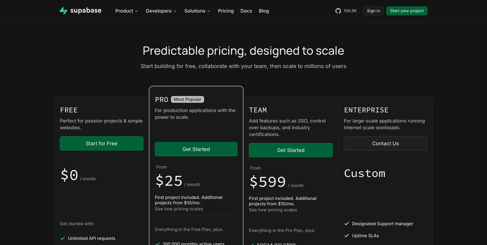
- $25 → $599: a 24× jump with no plan between
- “From $25” — the real total still needs a click
- Enterprise "Custom" with no starting point
3 critical blockers
-
The jump from Pro to Team is a cliff
Pro is $25/mo; the next tier, Team, is $599 — a 24× step with nothing in between. A team that has outgrown Pro but isn't ready for Team has nowhere to land, and the card doesn't explain what justifies the leap.
-
“Predictable” pricing still needs a click to total
The headline promises predictability, but each plan reads "From $25/mo… additional projects from $10/mo… see how pricing scales". The number a buyer will actually pay lives one click away, so the promise isn't fully kept on the page itself.
-
Enterprise gives no anchor
“Custom” with “Contact Us” and no “starts at” leaves larger buyers guessing whether they're even in range before they invest a call.
Where the 8.0 comes from
This is a well-built pricing page: a clear recommended plan, a CTA on every card, and honest “from” pricing that doesn’t pretend a usage-based product is flat. The one structural weakness is the canyon between Pro and Team — a $25 plan and a $599 plan with nothing between them — which strands exactly the growing teams Supabase most wants to keep.
5 quick wins
-
Bridge the Pro-to-Team gap
A short "when to move to Team" line — or a middle option — catches the teams falling into the $25-to-$599 canyon.
-
Total a typical bill
Show "a typical team pays around $X" near Pro so predictability is demonstrated on the page, not just claimed in the headline.
-
Pull the scaling example onto the card
One inline "each extra project is +$10/mo" line makes the model legible without leaving the page.
-
Anchor Enterprise
A "from" figure or a band gives large buyers a way to self-qualify before contacting sales.
-
Keep what's working
The "Most Popular" badge and a visible CTA on every card are doing real work — protect both in any redesign.
How the score is read
Every page is read through the same four lenses and scored on one scale, so the number means the same thing on your page as it does on anyone else's. Most real product pages land between 5 and 7.
- Losing people A first-time visitor cannot tell what this is, or the path to the core action is broken. Fixing one thing here moves more than a redesign anywhere else.
- Works, leaks Nothing is broken and motivated people get through. The losses are the ones you never see: hesitation, comparison, quiet exits.
- Deliberate Someone has thought about the sequence, the copy and the moment of doubt. What is left is refinement, not repair.
The four lenses behind this number, and why it is a judgement rather than a calculation, are set out in the Uxerfy Score.
A page can promise predictability, but the visitor only believes it when they can total their own bill without leaving the page. Show the number; don't link to it.