Reference library · 10 examples
SaaS Pricing Page Examples
A library of SaaS pricing pages worth studying — what each one does well, and where it adds friction. Reconstructions, annotated from a UX read. Filter by what you're looking for.
-
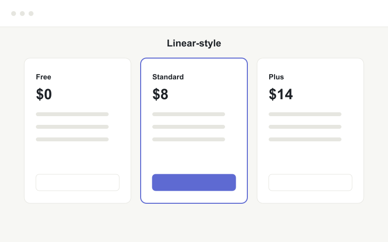
Linear-style
Clear tier ladder and one obvious default. The middle plan is doing the persuading, as it should.
Read the full teardown → -
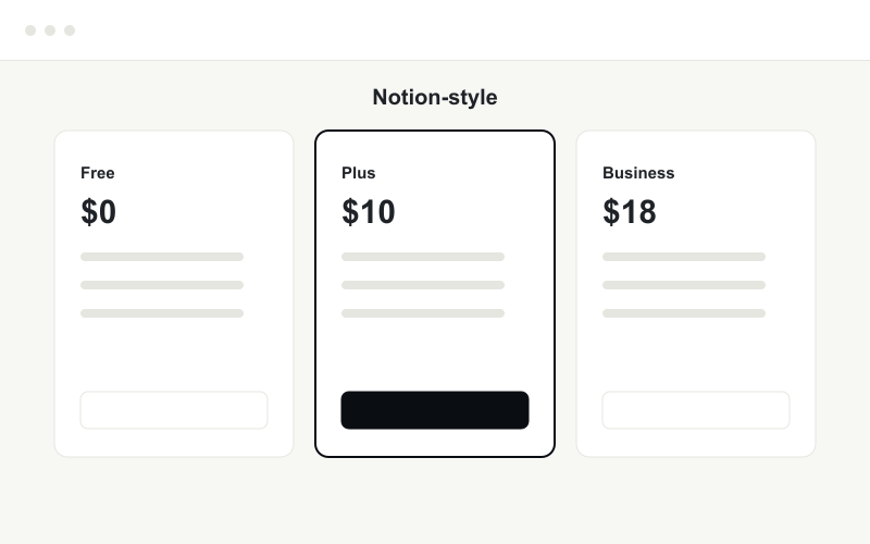
Notion-style
Generous free tier as the top of the funnel. Watch that per-seat pricing is legible before the click.
-
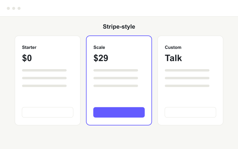
Stripe-style
Usage-based framing works here, but the jump to "Talk to us" hides the number a buyer wants.
-
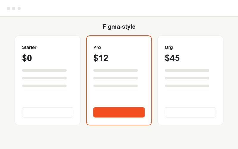
Figma-style
Team-oriented ladder. The org tier's value has to be stated in outcomes, not features.
-
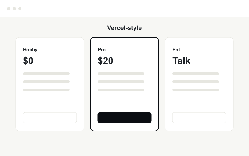
Vercel-style
A free "hobby" tier lowers the barrier for the people who become champions internally.
Read the full teardown → -
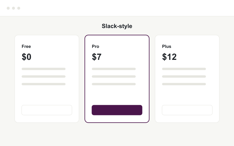
Slack-style
Low entry price on the paid tier makes the upgrade feel small. The value gap between tiers needs to be obvious.
-
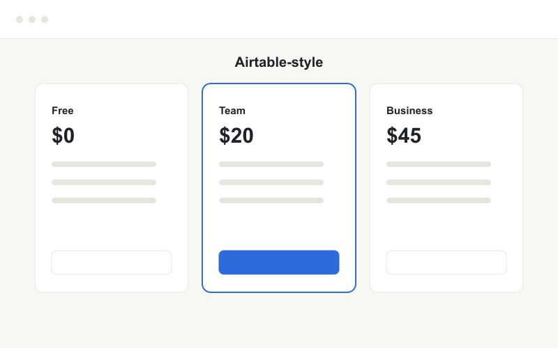
Airtable-style
The gap between free and team is wide. A clear "who each plan is for" line would help buyers self-select.
-
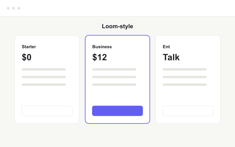
Loom-style
Strong free tier for a viral product. The enterprise CTA should still hint at a starting price.
-
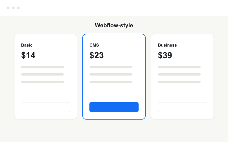
Webflow-style
No free tier raises the stakes on the page's clarity — every plan has to justify itself immediately.
-
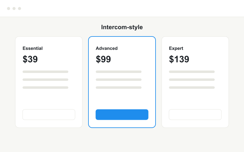
Intercom-style
Premium pricing needs premium clarity. At these numbers, ambiguity costs the most.