BigCommerce · signup · E-commerce
BigCommerce’s signup page, inspected
A UX teardown of BigCommerce's signup: why asking for projected revenue before the trial starts sizes people up at the wrong moment, and five fixes.
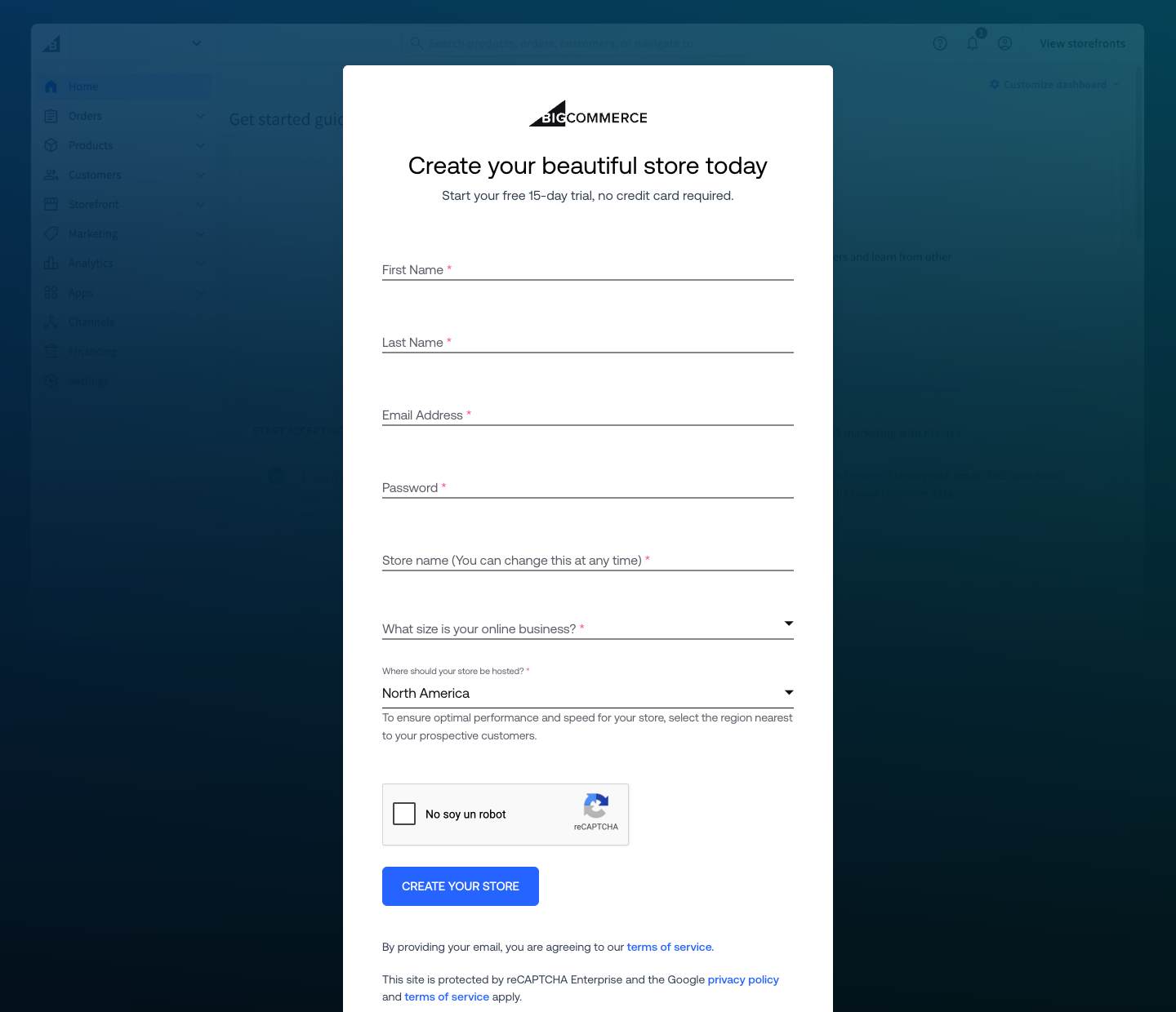
- "No credit card required" stated up front — the page's strongest move
- Projected revenue, asked before anything has been created
- reCAPTCHA renders in Spanish on a page declaring lang="en-US"
- The terms you agree to sit below the button that agrees to them
3 critical blockers
-
The form asks how much money you make before it has shown you anything
"What size is your online business?" is required, and its options run from "I haven't started selling yet" to "More than $250M". The field is named projectedAnnualRevenue in the markup, which is what it is — a lead-scoring question. The person a 15-day free trial exists for is the one who has not started, and this asks them to say so in a dropdown whose other options reach a quarter of a billion dollars. It reads as being sized up at the door.
-
Required fields are marked in a way no screen reader can read
Every label carries a pink asterisk, and it is a CSS ::after pseudo-element rather than text. Not one of the seven inputs carries a required or aria-required attribute. So a screen-reader user gets no indication of which fields are mandatory, and at 3.25:1 against white the asterisk sits below the 4.5:1 minimum for a low-vision user to be sure it is there at all. The information is real; it is only available to people who can see a small pink glyph.
-
The terms you are agreeing to sit 42px below the button that agrees to them
"By providing your email, you are agreeing to our terms of service" is placed after the submit button, not before it. Agreement is by implication rather than a checkbox, which is a defensible pattern — but only if the sentence is somewhere a person reads before they act. Here the visitor commits and then, if they scroll, learns what they committed to.
Where the 6.0 comes from
This is a competent page doing one thing badly. The offer is stated cleanly — “free 15-day trial, no credit card required” sits directly under the headline, which is more than most trial pages manage — the button says what it does rather than “Submit”, and the hosting field explains itself in a sentence. The floating labels work correctly and never collide with the value.
What pulls it down is a single decision: seven fields stand between a visitor and a product they have not seen, and one of them asks how much money they make. The form is 848px tall with roughly 49px of air between fields, so the submit button sits 1,062px down the page — below the fold on a common laptop. That is survivable on its own. Combined with a required revenue band and an implicit legal agreement placed after the button, it turns a low-commitment offer into something that feels like an application.
The accessibility gap is the quiet one. Nothing about it is visible to the team that shipped it, because on a screen it looks finished.
5 quick wins
-
Move the revenue question out of signup
Ask it on the first screen inside the product, after the account exists. The answer is more accurate once someone is invested, and it stops the trial gate reading like a qualification call.
-
If it has to stay, say why it is there
One line — "so we can suggest the right setup for your stage" — converts an interrogation into a service. The hosting field below it already does exactly this and reads far better for it.
-
Add required and aria-required to the seven inputs
The asterisks already claim it visually. Adding the attributes makes the same claim to assistive technology and to the browser's own validation, and costs one attribute per field.
-
Move the terms sentence above the button
Same words, same link, forty pixels higher. A person reads what they are agreeing to before they agree rather than after.
-
Pass hl to reCAPTCHA to match the page
The widget loads with hl=es on a document declaring lang="en-US", so a visitor in Spain reads "No soy un robot" inside an otherwise English form. One parameter aligns it with the page it sits in.
How the score is read
Every page is read through the same four lenses and scored on one scale, so the number means the same thing on your page as it does on anyone else's. Most real product pages land between 5 and 7.
- Losing people A first-time visitor cannot tell what this is, or the path to the core action is broken. Fixing one thing here moves more than a redesign anywhere else.
- Works, leaks Nothing is broken and motivated people get through. The losses are the ones you never see: hesitation, comparison, quiet exits.
- Deliberate Someone has thought about the sequence, the copy and the moment of doubt. What is left is refinement, not repair.
The four lenses behind this number, and why it is a judgement rather than a calculation, are set out in the Uxerfy Score.
A signup form is the one place a product has earned nothing yet. Every question that serves the business rather than the visitor is paid for in people who close the tab — and the question about money is the most expensive one to ask first.